When we post about new Sketch releases, we usually talk about the big new features — things like prototyping or performance upgrades. But sometimes, that means the smaller details can get overlooked.
Over the years, we’ve added all kinds of neat little tricks to the Mac app to make it easier and more intuitive to use. So now we thought it was time to pull out a few of the best. Whether you’re a newcomer or a seasoned pro, we hope there’s something in here that surprises you.
1. Drag to delete Styles
Let’s start with a quick, simple trick. If you want to remove a Style property (like a blur or a fill), you can simply drag and drop it out of the Inspector panel.
It’s not the most revolutionary thing in the world, but it’s a time-saver. Also, that little ‘whoosh’ is far more satisfying than just unchecking it and clicking the trash icon.
2. Resize layers with the arrow keys
When it comes to design, every pixel counts. And when you’re adjusting fine details in your project, clicking and dragging a layer with your mouse can be really disruptive — and imprecise — when you want to make only tiny changes.
So why not just resize the layer using a keyboard command?
| ⌘ arrow keys | Expand or contract by 1px |
| ⇧⌘ arrow keys | Expand or contract by 10px |
These commands are life-savers when you’re making final edits to a project and want to make sure every layer is perfectly sized.
3. Customize your preferences
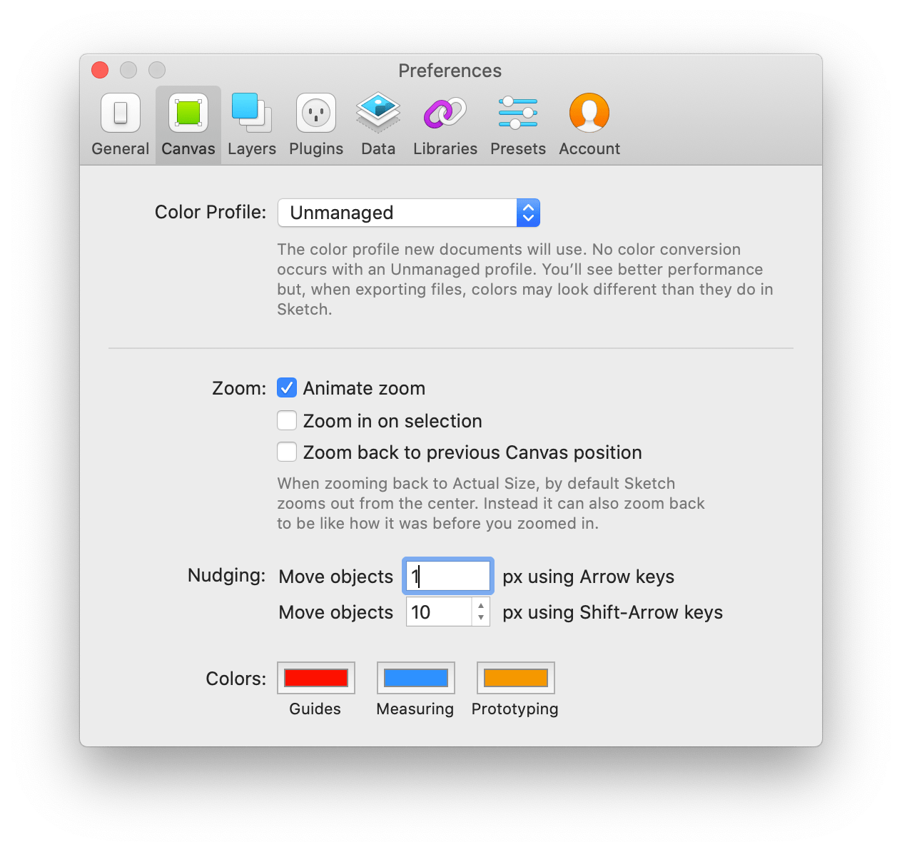
So now we know that using Cmd and the arrow keys lets you resize layers. And of course, you can hit an arrow key on its own to move a layer 1px, or hold Shift to move it 10px. Simple.
But did you know that you can also customize these nudge distances by changing your nudging settings? Head to Sketch > Preferences, then choose the Canvas tab. There, you can adjust how far your layer moves when pressing the arrow key.

This can be particularly helpful if you’re working with a grid system, as you can set your distances to perfectly match your layout. No more constant nudging — just a single press and your layer is exactly where you need it to be.
Here’s another handy Preferences tip if you find yourself duplicating a lot of content. In the Layers tab, you can disable the option to offset duplicated layers (so they’ll appear directly over the original). You can also disable the automatic renaming of the layer — so your duplicate will be named the same as the original. This one won’t apply to everyone, but it’s handy to know.
4. Update opacity and gradients with the keyboard
We know that sometimes, you need more precision than you can get using your mouse. It can take a lot of fine movements to find exactly the setting you want for things like layer opacity. So we made it easier to be precise.
Rather than clicking and dragging (and undoubtably landing on some random percentage), you can simply select the layer, then type the percentage opacity you want. You don’t need to click anywhere — just type. Single numbers will set a rounded percentage value (e.g. type 5 to get 50% opacity), while typing two numbers gives you more precision. Hit 0 to return to 100%.
The number keys are also handy when you want to apply a gradient to an object. You can place gradient points at different intervals with the 0-9 keys to give you a more precise gradient layout. And if you want to add a gradient point exactly between two other points, you can just hit =.
5. Rasterize layers faster
If you’re bringing assets from Sketch into another application, this could be a game-changer.
Exporting complex groups of layers into different apps at the right size and with the right name can be time-consuming. One option is to export the asset, then re-import it as one flat image. But there’s a much faster way to do this. We’ll leave it to our friend Joseph to explain:
By making your asset exportable and giving it the right filename suffix, you can drag the layer onto the Canvas (while holding the Option key) to place a bitmap image version into your design. In doing that, you’ll get a flat bitmap, at the right resolution, with the right name, in seconds.
6. Right click > Replace With
This one can be a huge time-saver when making changes to layers in your design. If there’s a Symbol in your project that you’d like to swap out, simply right-click on it and hover over Replace With. The menu will show you all the Symbols in your document and you can choose the one you want with a click.
7. Customize your toolbar
We set up the Sketch toolbar to put the most commonly used tools within easy reach. For beginners, especially, this makes it even easier to get to know the app.
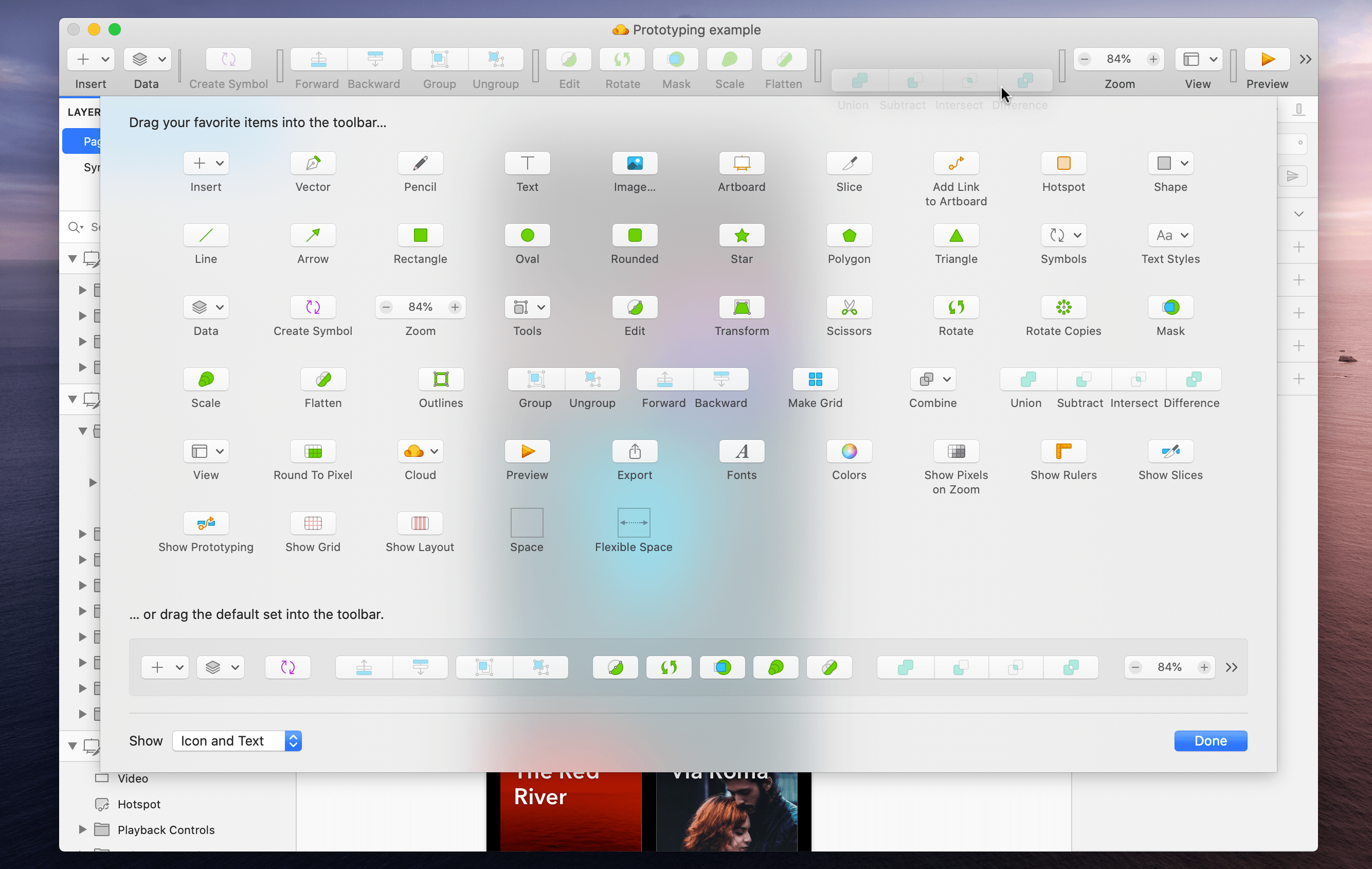
But we know that once you’re more comfortable in Sketch, you may find you’re using some tools much more than others — and you’d prefer easy to access to them from the toolbar. The good news is, that’s totally possible.

Right-click on the toolbar and select Customize Toolbar… The menu will let you drag and drop tools in and out of the toolbar, so you can create your perfect Sketch setup, with only the tools you need.
8. Use math in the Inspector
Our Inspector is smarter than you might think. You probably know you can adjust the size of a layer by typing its dimensions into the Inspector. But did you know you can also use math to resize those layers based on the dimensions that you’ve already set?
That means that if you need to double the size of a layer, you can simply add *2 to the end of the current dimensions — and the Inspector is smart enough multiply the size by two. You can also use letters after these values to tell Sketch which edge of the shape to expand from when setting dimensions. For example, if you wanted to expand downwards from the top, you could type *2t. To expand left from the right-hand edge, you could write *2r .
The same trick applies for adding (e.g. 50+10), subtracting (e.g. 50-5), and dividing (e.g. 50/2). You can use it to calculate circles, too — trying using pi in your calculations, for example. You can even type a percentage in the size fields to reize the layer relative to the Artboard it is on (e.g. 100% makes the layer width the same as the Artboard) or relative to the largest item of the group it is in.
Say goodbye to doing mental calculations and let Sketch do the hard work for you. Who became a designer to do math, anyway?
9. Read the documentation
We promise the people who wrote the documentation didn’t make us put this here. But our docs do contain a goldmine of cool tricks and shortcuts for Sketch — so you’ll definitely want to give them a read.
How else would you know that you can swap an image for another one after you’ve already styled the layer? Or reduce an image’s size inside Sketch, without having to leave the app? Or select multiple layers simply by holding down the Shift key? You get the point.
Did we miss a handy trick that you use every day? Let us know on Twitter. And for more timesaving tips, take a look at our guide to the essential Sketch keyboard shortcuts, too.


